
Customizing portal themes
Your portal’s default theme can be customized: style configurations are managed from the Portal > Style page in your back office.
The header displays a "Current action" drop-down menu to manage versioning (see Versioning themes below). Three important buttons are also displayed in the header:
Save saves the new configurations
Preview opens a preview in a new tab, showing your portal with the newly applied configurations
Make live applies the newly applied configurations and updates the live theme on your portal
Then, a block of four tabs allows you to configure the different parts of a portal theme (see Customizing a portal theme below):
Portal theme - a no-code editing interface that lets you adjust elements in the left panel and instantly see the result in the live preview on the right
Stylesheet - to add more style to the portal with CSS
Header - to modify the header with HTML code
Footer - to modify the footer with HTML code
Note that grid options and responsive breakpoints are standardized across all pages.
Versioning themes
Portal themes are versioned, which means that each customized new theme has a version number assigned to it. Once a theme is finished and made live, another version is automatically created, which is the new draft theme on which to work until it is ready to be live.
The "Current action" drop-down menu displayed in the header indicates which version is currently being worked on. It allows you to select the previous theme that was already made live.
Once a theme is live, it is locked and can no longer be modified. Only the latest draft version can be modified.
While working on the latest draft version of the portal theme, it is possible to preview what the portal will look like with this new theme. The Preview button is opens a new tab that shows what the portal configured with the draft theme would look like.
Only users able to edit workspace properties can preview the latest theme version. If sharing the URL with other users who were not granted the right permissions, they will simply see the portal with the current live theme.
Customizing a portal theme
Portal theme
The portal theme is organized into three blocks. Each block contains an editor on the left and a live preview on the right. The live preview updates instantly as you make changes, helping you ensure consistent branding by aligning colors and typography with your company identity.
Feel free to interact with the elements in the preview. This lets you see how interactive states—such as hover and active—will appear to users.
General section
The “General” section contains two tabs.
General appearance tab allows configuration of the overall look and feel:
Accent defines the primary accent color palette (used in active or hover states for interactive elements). The accent color range adapts across the portal. You can also copy the color codes to keep visual consistency in other parts of your theme.
Background sets the page background color.
Section adjusts adjusts the background color of content sections, such as grouped blocks inside a page.
Divider controls the color of all divider lines used to structure the page, as well as the borders that frame different sections.
Corner roundness defines the roundness of the corners on different components in the platform. For simplicity, four options are available, from sharp corners to fully rounded.
Border customizes the color of borders around form input fields. It also helps ensure sufficient contrast with the background to support accessibility.
The Typography tab controls text styling:
Select your font from the Font dropdown in both the Titles and Texts sections. The following fonts are available:
System font: The default font of your browser.
Google Fonts, such as Roboto, Raleway, Poppins, Overpass, Open Sans, Noto Sans, Montserrat, Figtree, Archivo.
Custom fonts: The fonts added in Portal > Images & Fonts. These appear with the label "Custom fonts" below their name.
If you've previously defined fonts in your CSS stylesheet, we recommend removing them and using this no-code configuration instead. It’s easier to manage and automatically updated.
Define weight, size, and color for titles (H1, H2, and H3) and size and color for primary and secondary texts. Links will inherit the size of the surrounding text (primary or secondary).
Buttons
The “Buttons” section controls the appearance of buttons, ensuring consistent styling across primary, secondary, and tertiary button types.
You can set a specific corner roundness for buttons, independent of the general corner roundness defined under “General” (above). Four options are available, ranging from sharp corners to fully rounded.
Each button type has its own tab where you can customize its look.
Primary buttons are the main call-to-action buttons. They use strong background fills and prominent text to draw attention.
Secondary buttons act as alternatives to primary actions. They usually have a lighter style, often with outlined borders, so they remain visible without competing with the primary button.
Tertiary buttons are the least prominent actions. They are text-based (with optional icons) and have no background or border by default. They are best used for supplementary or low-priority actions.
Each button type comes with its own customization options. If a setting is not available, it means that style should not be applied to that button type. This helps guide you toward consistent styling and avoid common UX mistakes.
Background sets the fill color in normal and hover states. Only primary buttons can have a background in the default state. The hover state is customizable for all button types.
Border defines the outline color for secondary buttons.
Text & icon configures the color of the button label and any accompanying icons. This option is available for all button types.
Catalog cards
The “Catalog cards” section lets you control the appearance of catalog cards, which are the first window into your assets.
Background sets the fill color for the card in both default and hover states.
Border defines the outline color of the card, also customizable for both default and hover states.
Corner roundness has four available options, ranging from sharp corners to fully rounded.
Note that the layout of the catalog cards is customized in the dedicated space Catalog > Settings.
Accessibility indicator
When customizing the portal theme, an accessibility check runs automatically. If any chosen styles create insufficient color contrast, a warning banner appears at the top of the page. Red ****dots mark the elements where accessibility issues will occur. To resolve these issues, click on More details in the warning message for guidance.
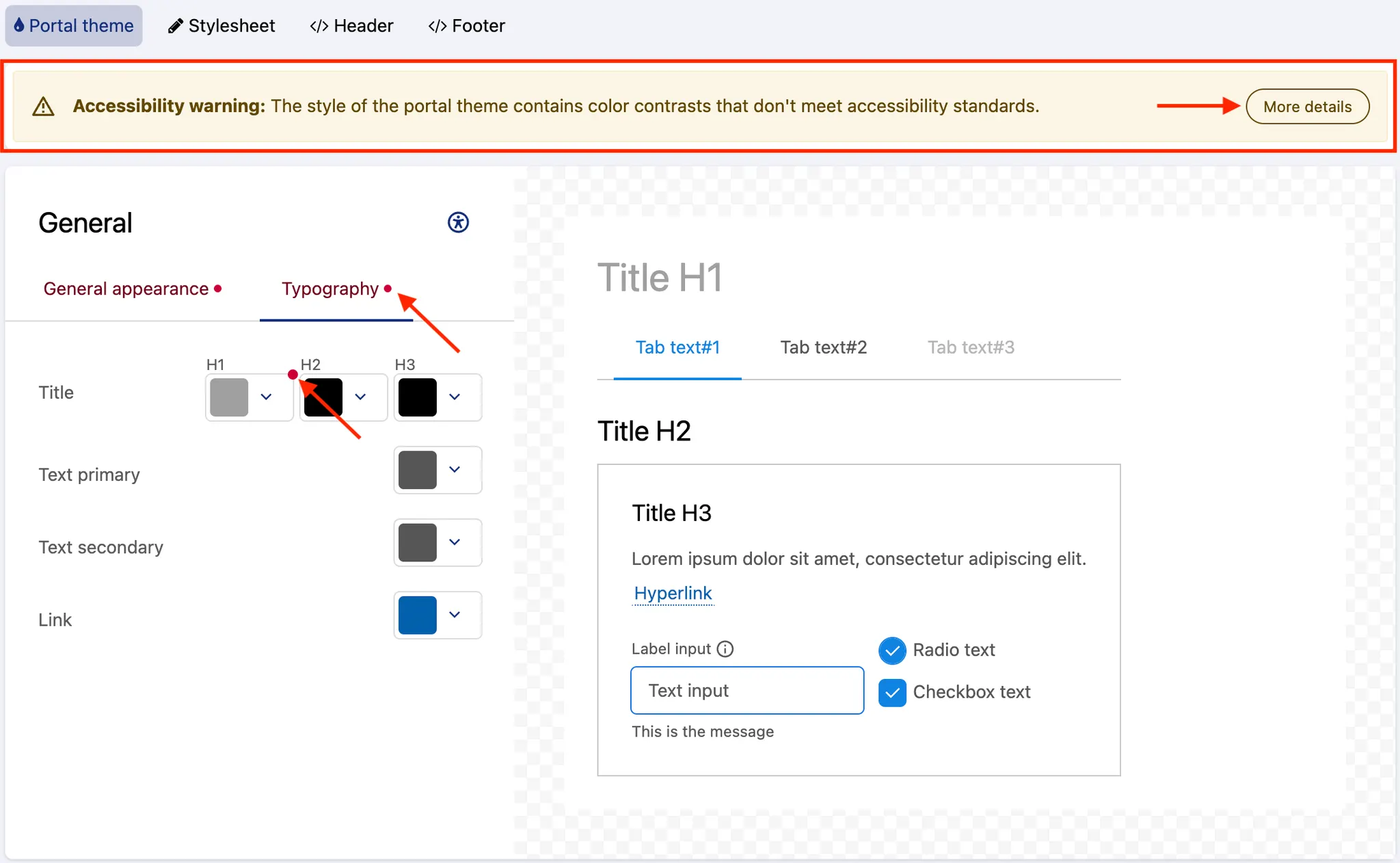
Note that the tool checks the color accessibility of text and visual elements based on WCAG Level AA standards. Regular text needs a contrast ratio of at least 4.5:1 with the background, and visual elements must have at least 3:1 contrast with nearby colors.
Stylesheet
The Stylesheet tab displays an editor in which to add pure CSS style rules. It allows you to push the customization of a portal theme even further.
All rules added in this tab will have precedence over the configurations defined in the other theme tabs.
To change the style of an element, find the element's class and change the desired CSS property. Class names are written as block, element, modifier: .ods-block[--blockmodifier][__element][--elementmodifier].
Header and Footer

The Header and Footer tabs each display an editor in which to add pure HTML. Although both the header and the footer can be partially customized via the Portal theme tab, these tabs allow you to push the customization of these areas of the portal even further. Note that the header background color and link colors are defined separately in the color pickers.
Both the header and the footer are wrapped within independent AngularJS applications, which means that standard Angular directives such as ng-if, ng-class, ng-show, and ng-hide can be used.
To collapse the header into a click-to-expand side menu below a certain viewport width, use the ods-responsive-menu directive.
Placeholders can also be used when customizing the header and the footer. They will be replaced with the content specified in the domain customization options such as menu items, language selectors, and logos.
The following placeholders are available in the Header tab:
Placeholder | Information |
| Main menu, with links to chosen pages |
| Menu containing links to login page and user account |
| Portal logo configured in Branding |
| Portal brand configured in Branding |
| Links to change the language of the portal |
The following placeholders are available in the Footer tab:
Placeholder | Information |
| Link to the Terms & Conditions defined for the portal, configured in Legals |
| Link for users to modify their cookies preferences. This placeholder is mandatory to enable the cookie banner. For more information, see Managing legal information. |
| Language picker for the languages specified for the portal |
| Huwise logo |
Note that JavaScript is not allowed for security reasons.