
Huwise Forms: Input blocks
This page lists all possible input blocks for the Huwise Forms feature, and how to configure them.
See this page for more information about the feature and instructions on how to edit your forms.
General information
Every input block in your form is automatically assigned a technical ID.
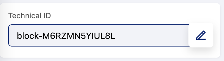
The technical ID is a unique identifier that identifies the corresponding field in the dataset created for your form's results.
In general, if you wish to change these IDs, we strongly recommend doing so before you publish and share your form, in order to avoid any discrepancies arising from results arriving before and after any change to an ID.
Most blocks offer three setting toggles:
Unique values: Toggle this to require that the value entered does not repeat any previously entered values.
Hidden: Hide this block in the published form. Respondents will not see it, but any pre-filled value assigned to this block will still be recorded in the submission.
Required: To make responding to this question or field obligatory.
And in general, regarding blocks that require users to input text:
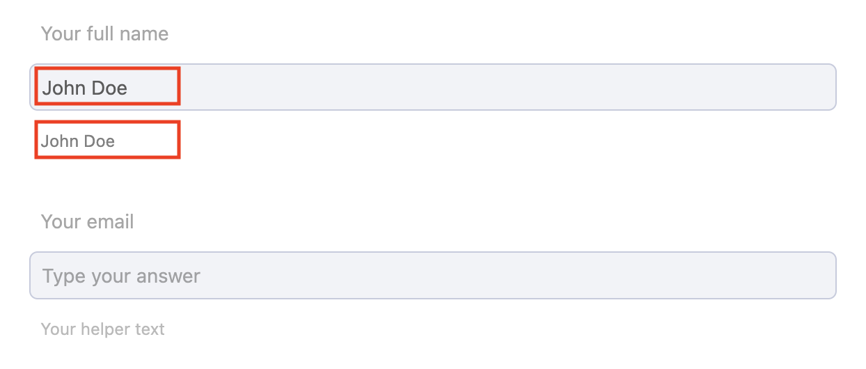
You can add placeholder text by typing directly into the input field (the first red box in the image below)
You can provide helper text (the second red box below)
Conditional logic
Your form can be made to adapt to user input by displaying new blocks only if they're relevant to that user.
For example, if your form allows users to report an issue, the questions can be tailored to the specific type of issue, such as a technical problem versus a billing issue. To achieve this, define the conditions for hiding or displaying each block.
To add a condition, double-click the block you want to edit and select "Add a condition." and defines:
An action: Show the target (display it only when conditions are met) or Hide the target (hide it when conditions are met).
An operator: AND (all conditions must be true) or OR (at least one condition must be true).
One or more conditions, each linked to a source field in the form.
The exact configuration options you're shown in the interface will depend on the type of input block and how constrained the user's answers are. A block where the user chooses from predefined values, or example, will have different options than a block where the user can freely enter their own responses.
You will decide whether the block is visible based on user input, considering conditions that depend on the type of the source field:
Condition category | Conditions | Works with |
|---|---|---|
Filled / Empty | Is filled, Is empty | All field types |
Text | Equals, Does not equal, Contains, Does not contain | Text, URL, SIRET |
Number | Equals, Does not equal, Less than, Less than or equal, Greater than, Greater than or equal | Number |
Boolean | Is true, Is false | Boolean |
Date | Is on, Is not on, Is before, Is before or on, Is after, Is after or on | Date/Time (date mode) |
Time | Is on, Is not on, Is before, Is before or on, Is after, Is after or on | Date/Time (time mode) |
List | Contains, Does not contain | Keywords, Dynamic Choice |
Multi-valued list | Is, Is not, Is any of | Dynamic Choice (multiple) |
Choice | Is, Is not, Is any of | Choice |
Note that "contains" and "does not contain" are case insensitive. In blocks with multiple possible responses, "is" or "is not" are inclusive—they require all of the designated responses to be present. If you want only one response to be enough, use "is any of."
Note that circular dependencies are not allowed. If field A's visibility depends on field B, then field B's visibility cannot depend on field A. The platform validates this automatically and prevents you from saving a circular configuration.
Form field types reference
Text input fields
Text
A general-purpose text input for collecting short or long written answers — names, descriptions, feedback, or any free-form text.
Setting | Options | Description |
|---|---|---|
Max length | Short (255 characters) | Controls the maximum number of characters the respondent can enter. Defaults to short. |
Placeholder | Free text | Hint text displayed inside the empty field to guide the respondent. Supports localization. |
Unique value | On / Off | When enabled, each submission must provide a value that no other submission has used for this field. Useful for collecting unique identifiers like employee IDs. |
URL
A text input specifically designed for web addresses. The platform automatically validates that the entered value is a properly formatted URL (e.g., https://example.com).
SIRET
A specialized input for French business identification numbers. SIRET stands for "Systeme d'Identification du Repertoire des Etablissements" — it's a 14-digit code that uniquely identifies a business establishment in France. The platform automatically validates the SIRET checksum to ensure the number is correctly formatted and mathematically valid.
Note that SIRET validation is strict: the platform checks not only the length and format but also the mathematical checksum of the number. A random sequence of 14 digits won't pass validation.
Numeric and rating fields
Number
A numeric input that accepts either whole numbers or decimal values, with optional minimum and maximum boundaries.
Setting | Options | Description |
|---|---|---|
Input type | Integer · Decimal | Choose whether the field accepts whole numbers only or also allows decimal values. Defaults to Integer. |
Min value | Numeric (optional) | The lowest acceptable value. Leave empty for no lower bound. |
Max value | Numeric (optional) | The highest acceptable value. Leave empty for no upper bound. |
Unique value | On / Off | When enabled, each submission must provide a value not already used in another submission. |
Rating
A visual rating input that lets respondents express a level of satisfaction or agreement. You can choose between a star-based pictogram scale or a wider numeric scale.
Setting | Options | Description |
|---|---|---|
Type | Pictogram (1–5) · Scale (0–10) | Pictogram displays star icons (or similar) from 1 to 5. Scale displays a numeric slider from 0 to 10. |
Min label | Free text | Label displayed at the low end of the scale (e.g., "Poor" or "Strongly disagree"). Supports localization. |
Middle label | Free text | Label displayed at the midpoint (e.g., "Average" or "Neutral"). Supports localization. |
Max label | Free text | Label displayed at the high end (e.g., "Excellent" or "Strongly agree"). Supports localization. |
Choice and selection fields
Choice
A single- or multiple-choice question with a predefined list of options. You control how the options are displayed and whether respondents can add their own answers.
Setting | Options | Description |
|---|---|---|
Input type | Single · Multiple | Single allows one answer. Multiple allows several answers. |
Choices | List of values | The predefined options respondents can pick from. Each option supports localization. |
Display format | List · Dropdown | List renders radio buttons (single) or checkboxes (multiple). Dropdown renders a select menu. |
Allow "Other" option | On / Off | Adds an "Other" option that lets respondents type a custom answer. |
Allow free text | On / Off | Lets respondents type freely in addition to selecting predefined options. |
Max options | Numeric (optional) | Limits how many options can be selected. Only applies when Input type is Multiple. |
Unique value | On / Off | When enabled, each submission must provide a value not already used in another submission. |
Dynamic Choice
A choice field whose options are loaded automatically froma dataset on your workspace. This is useful when the list of options changes frequently or is too large to maintain manually.
Setting | Options | Description |
|---|---|---|
Source type | Dataset | Where to load the options from. |
Dataset (if Dataset source) | Dataset + Field | Select a dataset and the specific field to pull values from. |
Enrich fields (if Dataset source) | Field list | Additional dataset fields to include alongside the selected value. |
Unique value | On / Off | When enabled, each submission must provide a value not already used in another submission. |
Auto-Fill
An enhanced version of Dynamic Choice that goes one step further: when the respondent selects an option, other fields in the form are automatically populated with related data from the same source. For example, selecting a company name could auto-fill the company address and phone number.
Auto-Fill inherits all settings from Dynamic Choice, plus:
Setting | Description |
|---|---|
Field mapping (Dataset) | Map other form fields to dataset columns. When the respondent picks a value, the mapped fields fill in automatically. |
Dataset Picker
A selection field that lets respondents pick one or more datasets from your workspace. The platform validates that the selected datasets exist.
Keywords
A tag-style input that lets respondents add multiple keywords or tags. Each keyword is entered individually, and the field displays them as removable chips.
Setting | Options | Description |
|---|---|---|
Max keywords | Numeric (optional) | The maximum number of keywords the respondent can enter. Leave empty for no limit. |
Contact and address fields
Contact
A structured block that collects contact information through multiple subfields. Unlike adding several separate Text fields, the Contact block groups related information together and provides specialized validation for each piece of data.
The Contact block includes six subfields, each of which you can independently configure:
Subfield | Description |
|---|---|
Full name | The respondent's full name. |
First name | The respondent's first name. |
Last name | The respondent's last name. |
An email address, with format validation. | |
Organization | The respondent's company or organization. |
Phone number | A phone number, with optional international format support. |
Each subfield has its own label, placeholder, help text, and required toggle — all of which support localization.
In addition to the per-subfield settings, the Contact block offers these options:
Setting | Description |
|---|---|
Email unique value | When enabled, each submission must provide an email address not already used in another submission. |
Phone unique value | When enabled, each submission must provide a phone number not already used in another submission. |
International phone format | When enabled, phone numbers must follow the international format (e.g., |
Note that email and phone number uniqueness are checked independently. You can enable uniqueness on one, both, or neither.
Address
A location input for collecting postal addresses or specific geographic identifiers. You can configure it to collect a full address or narrow it down to a postal code, city name, or INSEE code (a French commune identifier).
Setting | Options | Description |
|---|---|---|
Input type | Address · Postal code · City · INSEE code | Choose what kind of location data to collect. |
Auto-fill city | On / Off | Automatically fill in the city based on the entered address or postal code. |
Auto-fill postal code | On / Off | Automatically fill in the postal code based on the entered address or city. |
Auto-fill INSEE code | On / Off | Automatically fill in the INSEE code based on the address. |
INSEE code is a 5-digit code used in France to uniquely identify each commune (municipality). It's commonly used in administrative and statistical contexts.
Note that when the input type is set to Postal code, the platform validates that the entered value follows the 5-digit format.
Date and time fields
Date / Time
A flexible picker for collecting dates, times, or time slots. You can configure it to collect just a date, just a time, or a time range with opening and closing times.
Setting | Options | Description |
|---|---|---|
Mode | Date · Time · Time slot | Date collects a calendar date. Time collects a specific time. Time slot lets the respondent select a range with a start and end time. |
Time format | 12-hour (AM/PM) · 24-hour | Choose how times are displayed and entered. Only applies when the mode includes a time component. |
File and media fields
File Picker
A file upload field for collecting documents, spreadsheets, PDFs, and other files from respondents. You control whether respondents upload files directly, provide a URL reference, or both.
Setting | Options | Description |
|---|---|---|
Input type | All · URL only · File upload only | All accepts both file uploads and URL references. Choose one mode to restrict the input method. |
Max file size | 1 MB – 240 MB | The maximum allowed file size for uploaded files. |
Note that when a submission is deleted or updated, any files that are no longer referenced are automatically cleaned up from storage.
Image Picker
An image-specific upload field with built-in image format validation. It works like the File Picker but is restricted to image files.
Setting | Options | Description |
|---|---|---|
Input type | All · URL only · File upload only | All accepts both image uploads and URL references. Choose one mode to restrict the input method. |
Specialized fields
Boolean
A yes/no checkbox for collecting binary answers (true/false, agree/disagree, opt-in/opt-out).
Location
A geographic location picker that lets respondents select a point on an interactive map. This is useful for collecting precise coordinates — for example, the location of an event, a reported issue, or a point of interest.
Consent and legal fields
Legal
A mandatory consent block for collecting agreement to privacy policies, terms of use, or custom legal terms. Unlike other field types, the Legal block doesn't have a configurable label — it displays the legal text directly.
Setting | Options | Description |
|---|---|---|
Type | Default · Custom | Default uses your workspace's standard privacy policy and terms of use. Custom lets you define your own legal text. |
Privacy policy | On / Off | Show and require a privacy policy acceptance checkbox. |
Terms and conditions | On / Off | Show and require a terms and conditions acceptance checkbox. |
Custom legal text | Rich text | Your own legal terms, displayed directly to the respondent. Only used when the type is set to Custom. Supports localization. |
There are two important things to know about Legal fields:
Acceptance is mandatory. Every respondent must check the consent checkbox before submitting the form. The platform validates this automatically.
Consent data is not stored. Legal field responses are validated at submission time but are not included in the stored submission data. This means Legal fields are also excluded from dataset extraction. They serve solely to collect the respondent's agreement at the moment of submission.