
Exploring a dataset with the Explore data (beta) view
A new Explore data view is available on any published dataset. It let's you visualize and explore a dataset without having to use any complex tools.
You can build charts and filter the data to:
1) Gain insight about what the dataset provides
2) Make actionable outputs that you can share with other data consumers
To use this feature, go to the asset page of the dataset you wish to explore and click on the Explore data (beta) button.
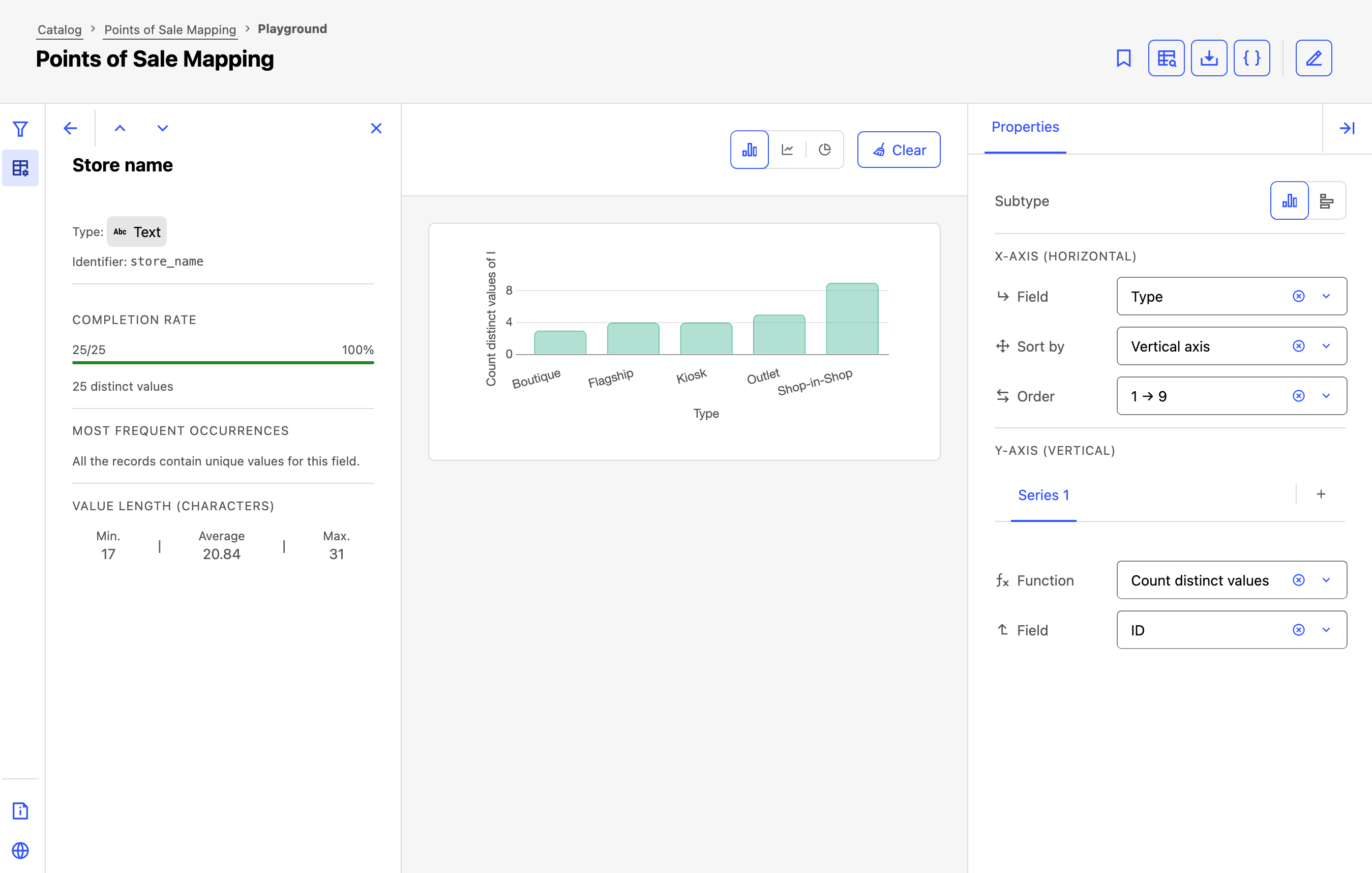
The Explore data interface
The Explore data interface is divided into three main areas with the visualization in the middle of the screen.
On the left, the "Filters" panel lets you narrow the data. In the center, the visualization area displays the chart. On the right, the Properties panel lets you configure it.
Note that you can toggle open or closed both the Filters and the dataset's Schema from the vertical menu on the far left. Consulting the schema can help you identify the fields you should use to filter or build a chart. To minimize or expand the Properties panel, click on the icon in the upper-right corner.
Creating a chart
To build a chart, filter for the data you wish you analyze, choose a chart family and which specific type of that chart you want to make, then configure the fields and calculation you want to use.
Filtering data
Use the Filters panel to refine the data shown in the chart.
As you add or change filters, the visualization updates to reflect the selected subset of the dataset. This makes it easier to focus on the values, categories, or time periods you want to analyze.
Choosing a chart type
Explore data supports three chart families, and each chart family includes one or more sub-types:
Column charts can be configured as both columns and bars
Line charts can be either simple lines or area charts
Pie charts can be configured as pie or doughnut charts
See "Multiple series and stacking" below for how to create stacked columns, bars, and area charts.
Configuring a chart's properties
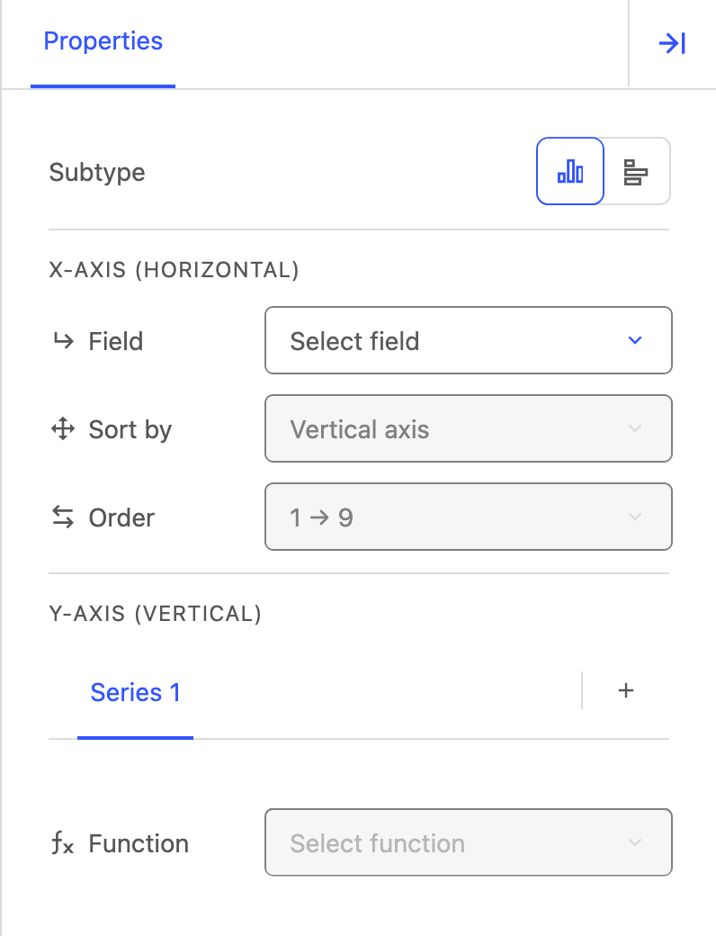
When configuring a chart's properties, the available options depend on the chart type and sub-type you select. As you update the chart properties, the preview updates automatically.
the X-axis and Y-axis
the Field, Sort by, and Order values
for one or more series, their Function and Field
for a pie or doughnut chart, the Function and Value
The available functions are:
Average
Count distinct values
Count records
Maximum
Median
Minimum
Sum
Which function should I use?
The most common source of confusion is the difference between Count records and Count distinct values:
Count records counts every row in the dataset, including duplicates. Use this to measure volume (e.g., number of transactions, number of incidents reported).
Example:
Question to answer: How many orders were placed?
Method: Use Count records on the orders fieldCount distinct values counts the number of unique values in a field. Use this to measure variety (e.g., number of unique cities, number of distinct product categories).
Example:
Question to answer: How many different customers placed an order?
Method: Use Count distinct values on the customer ID field
Multiple series and stacking
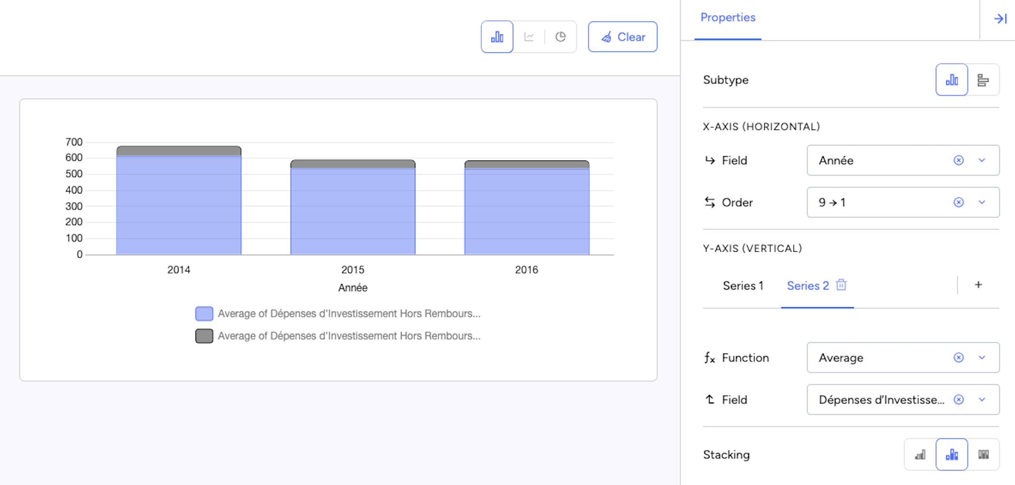
Some charts let you add more than one series so you can compare several values in the same visualization.
To add more than one series, click on the + icon on the right next to the first series. You may add up to 10 separate series.
Once more than one series has been added, stacking options become available for bar and area charts. Three stacking modes are available:
Separate (default) — Displays each series independently, for when you want to compare series side by side
Stacked — Combines the series in the same bar or area, for when you want to see both the total and how it breaks down
Percentage — Shows each series as a share of the total, for when you want to compare proportions, regardless of total size
Use Separate when you want to compare the series individually. Use Stacked when you want to compare both totals and composition. Use Percentage when you want to compare proportions rather than raw values.
Sharing a configuration via URL
The Explore data configuration (chart type, axes, filters) is automatically reflected in the browser URL. To share your analysis, simply copy and send the URL and the recipient will see the exact same chart you configured.
For data publishers
End users can access the Explore data view on published datasets with chartable tabular data.
To configure how users discover and explore a dataset, refer to the following: